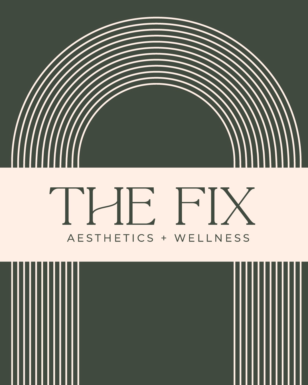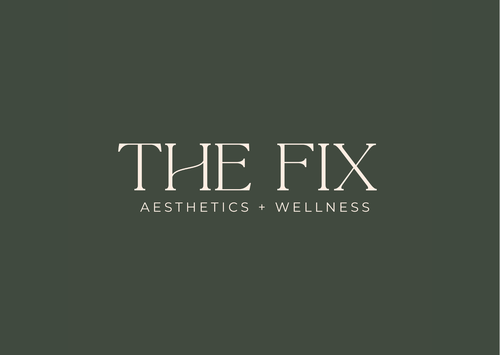
This logo was created for The Fix, a medical spa based in El Paso, Texas. The design is simple yet refined, reflecting the brand’s focus on elegance and high end care. The muted green and beige palette gives a natural, balanced feel that ties into themes of restoration and self-care. The clean typography and minimalist layout convey professionalism and trust, capturing the spa’s mission to help clients look and feel their best through expert, personalized treatments.
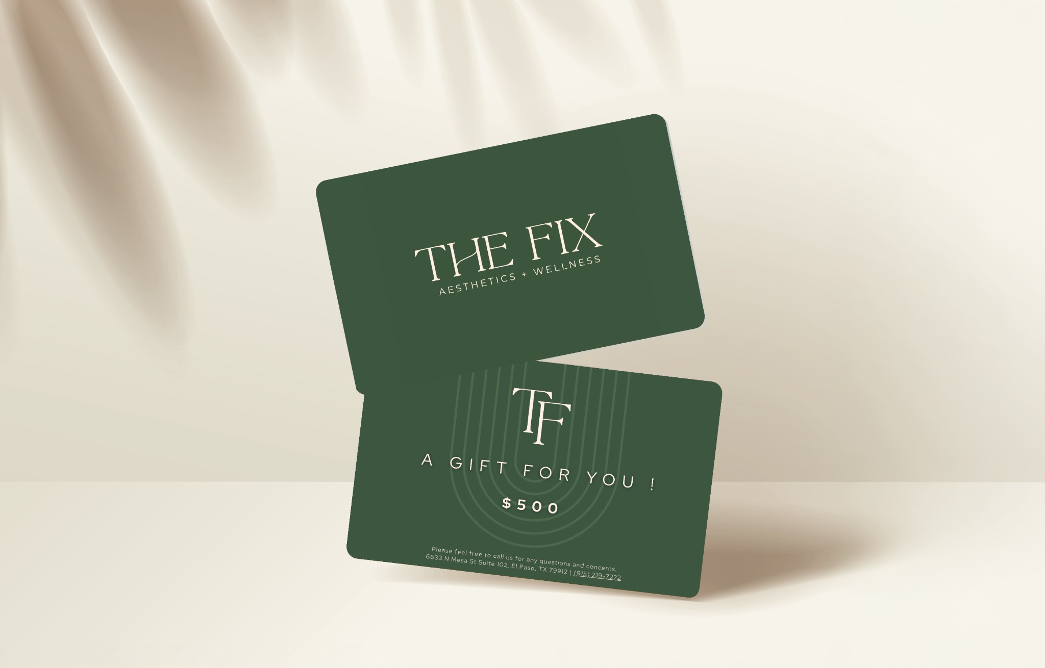
These elegant gift cards were designed to match The Fix’s aesthetic minimal, sophisticated, and for giving the gift of self-care
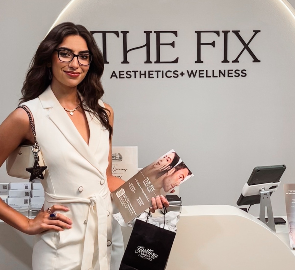
Here I stand in front of the logo I designed for The Fix. Proud moment seeing the vision come to life!
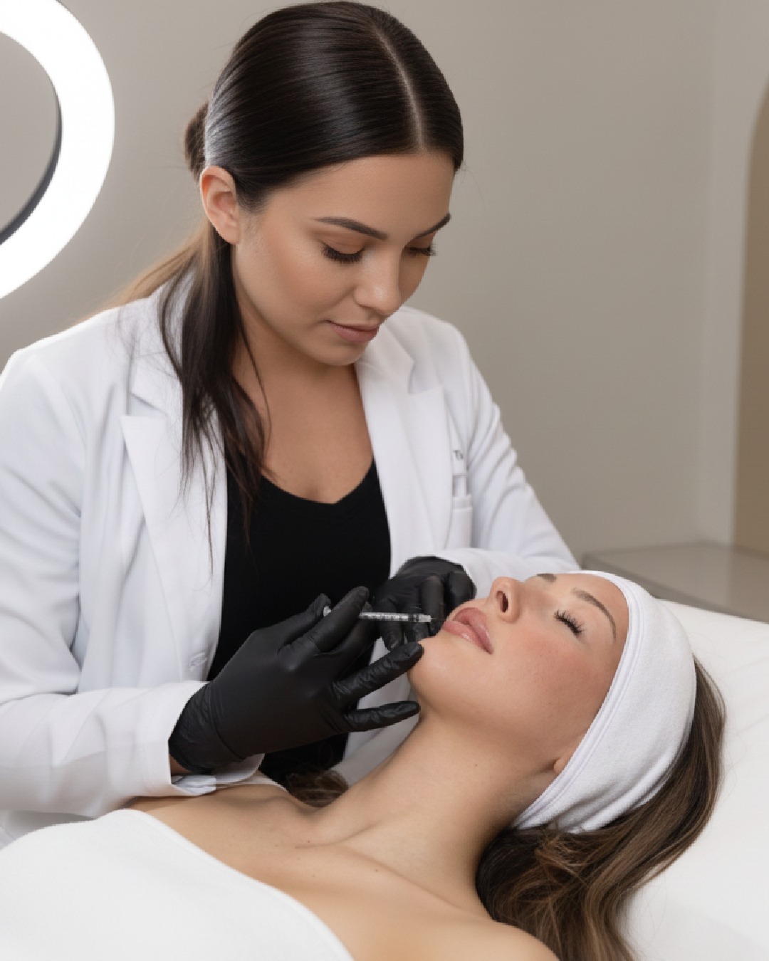
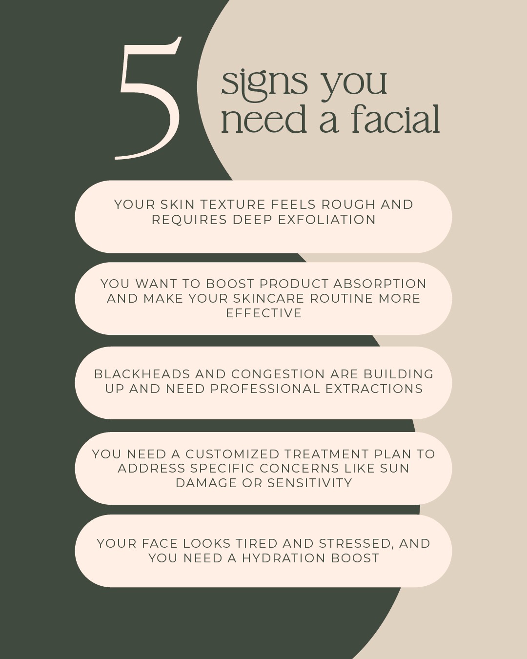
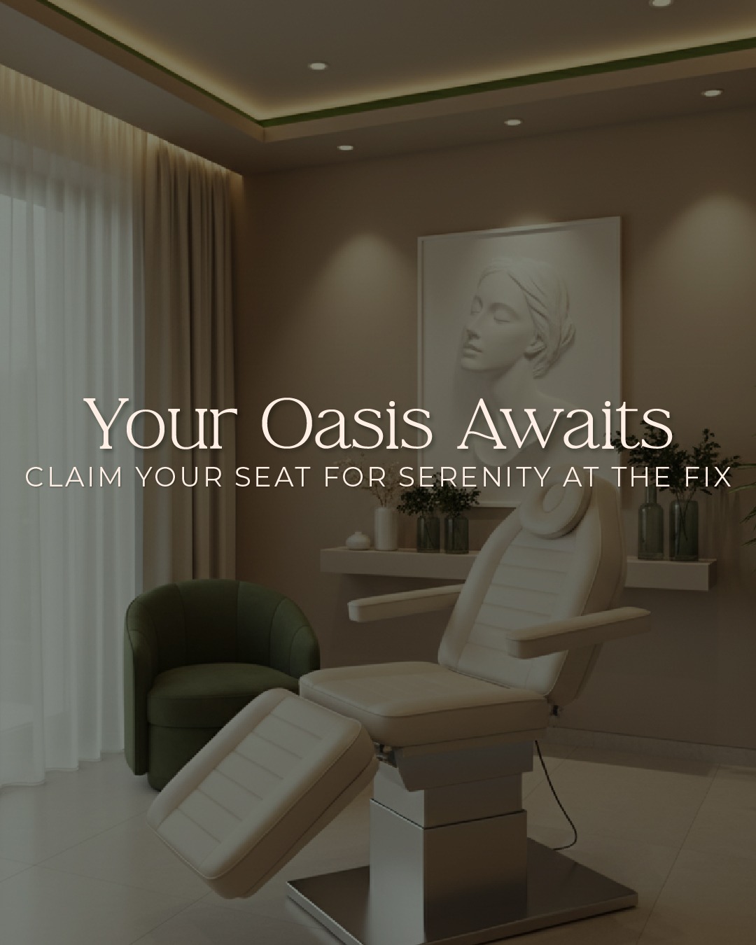
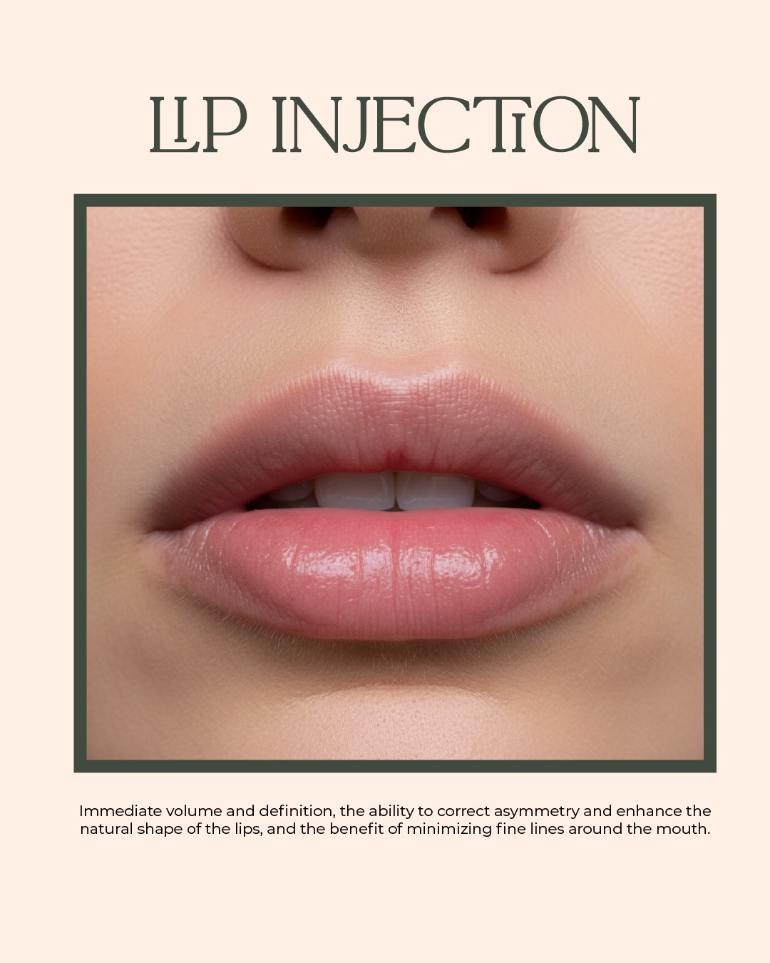
After redesigning the logo for "The Fix Aesthetics + Wellness", I designed an Instagram to visualize how the updated branding could be applied on social media platforms.

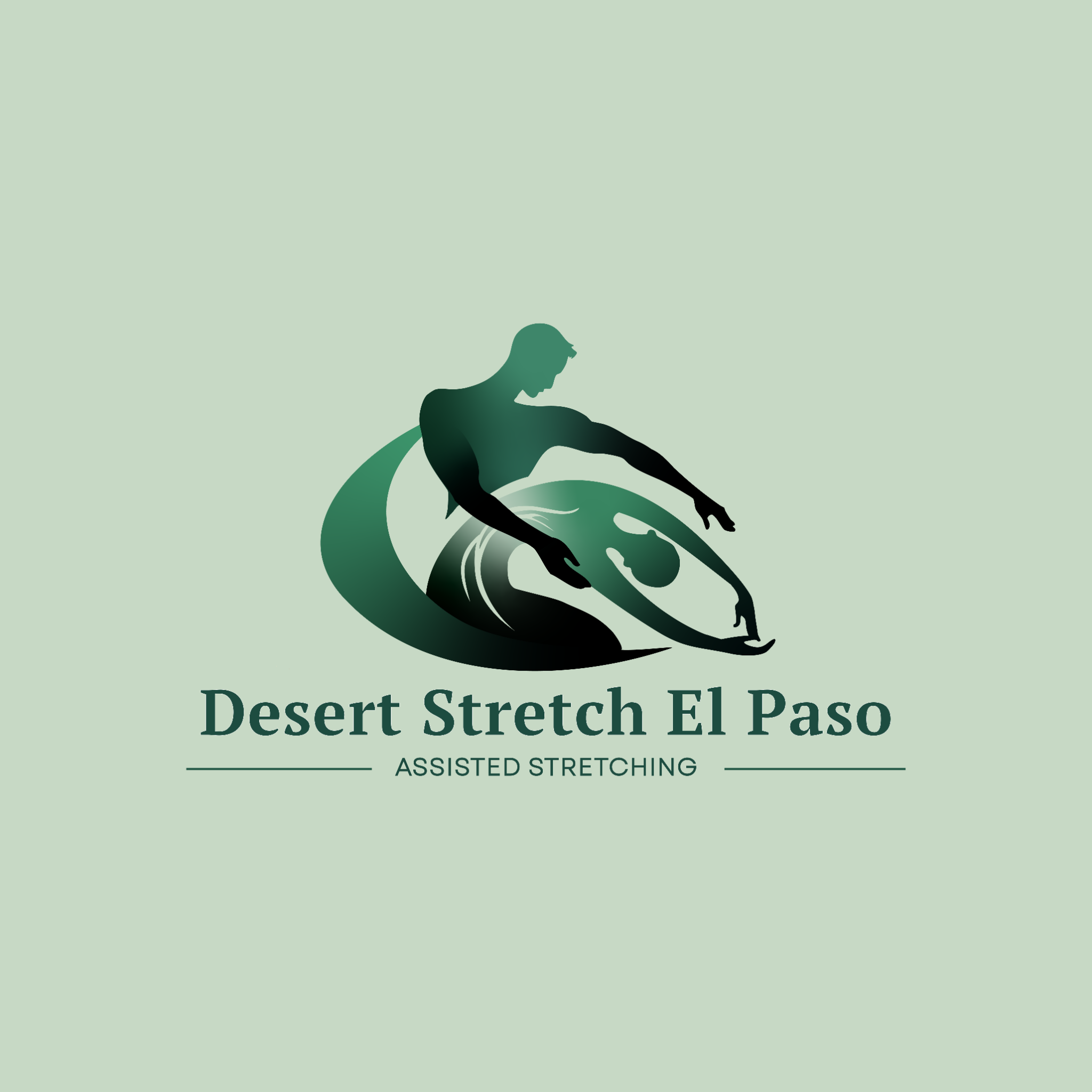
This logo was created for an assisted stretching business focused on health and healing. The green color palette gives off a calm, natural vibe, which ties into the idea of rejuvenating the body. The design shows two people stretching one helping the other, highlighting the business's supportive, personalized approach to wellness and flexibility. It’s all about care, trust, and helping people feel their best.
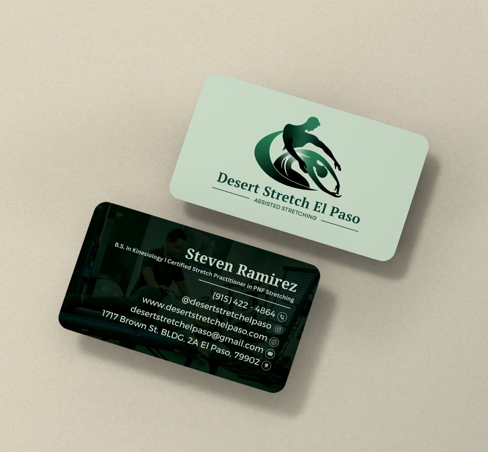
The business cards are designed with a clean, inviting layout, using the green color scheme to reflect the brand’s focus on health and wellness.
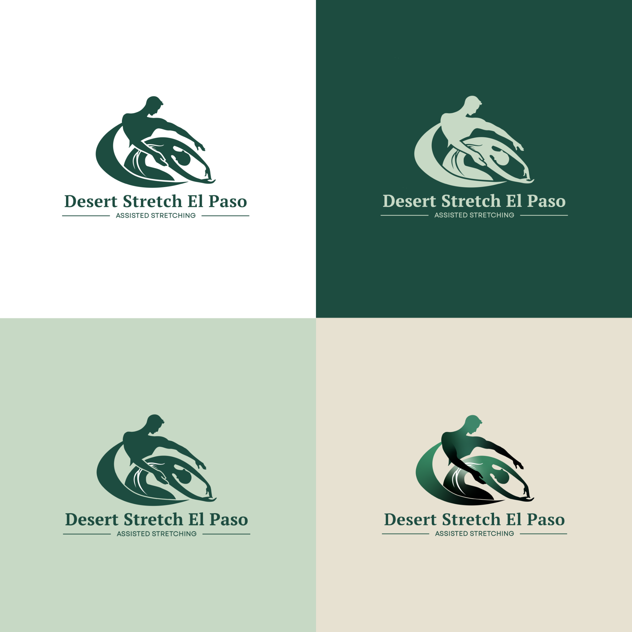
Multiple logo variations ensure versatility across different platforms, maintaining the brand’s message of support and healing in any format.
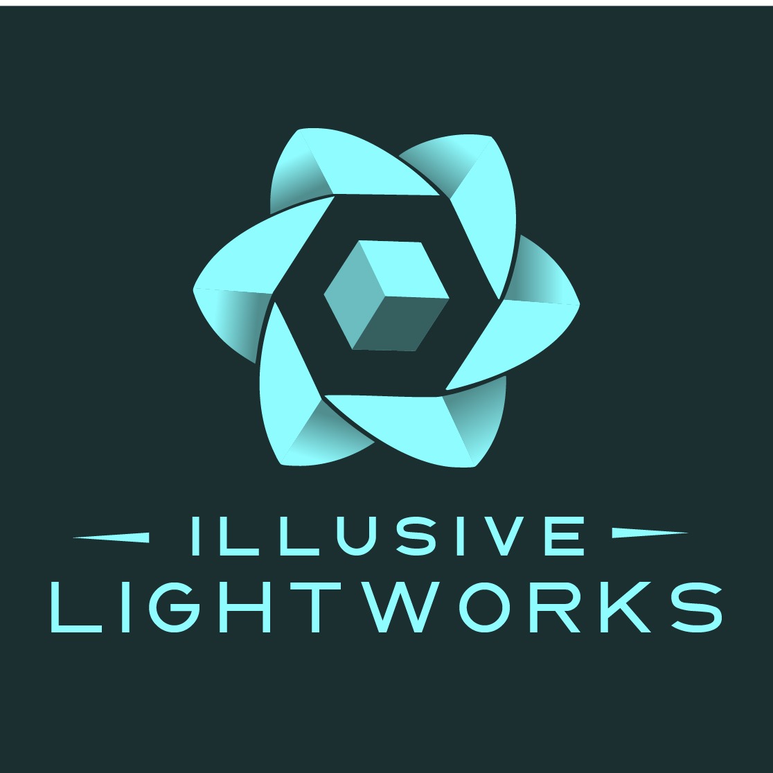
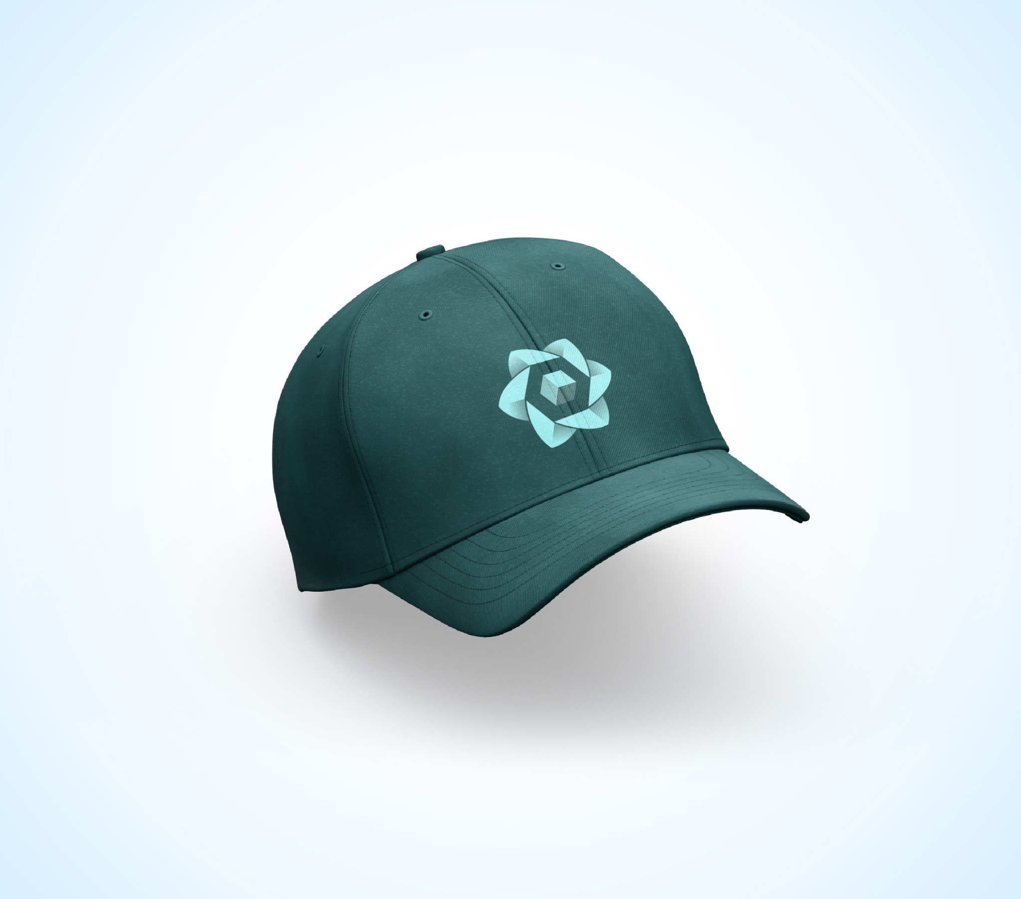
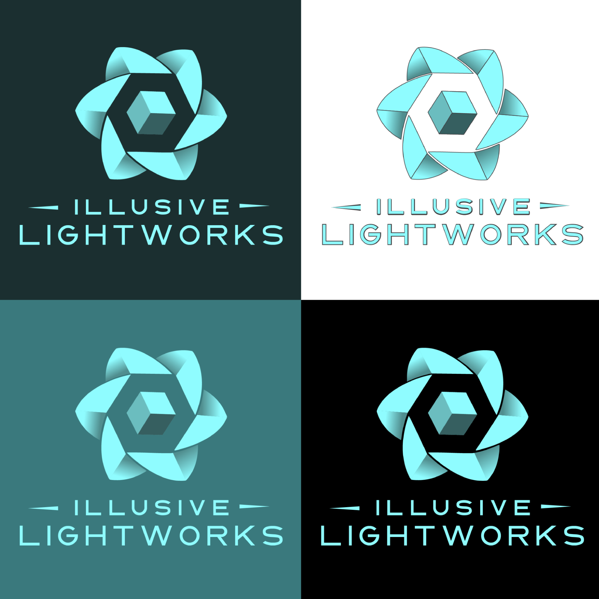
This logo was created for an app that lets users project artwork onto a 3D Printed Buddha statue. Designed to resemble a mandala flower, the logo represents creativity, technology, and artistic expression. The design captures the blend of technology and creativity, making it feel modern and dynamic.
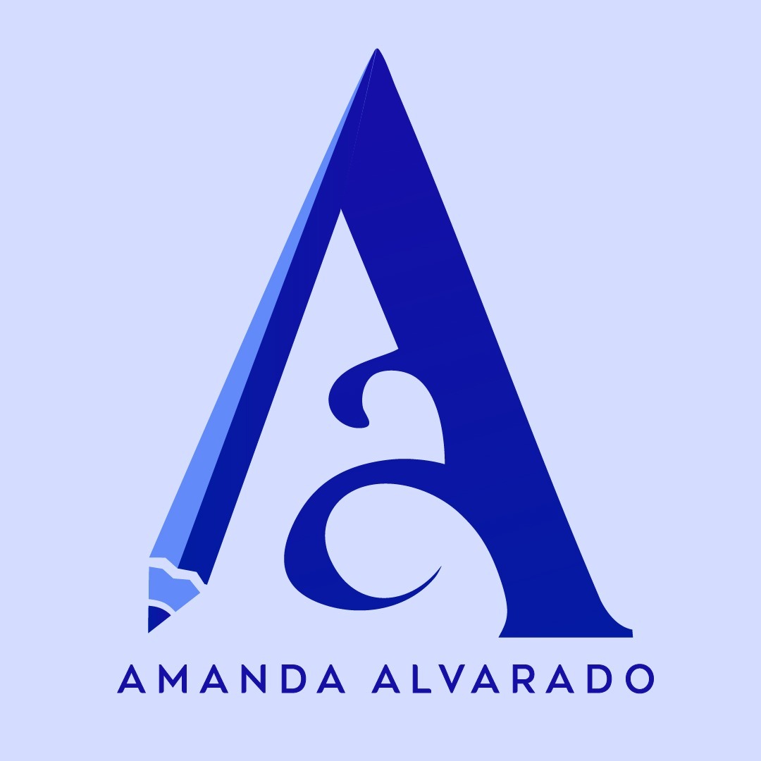
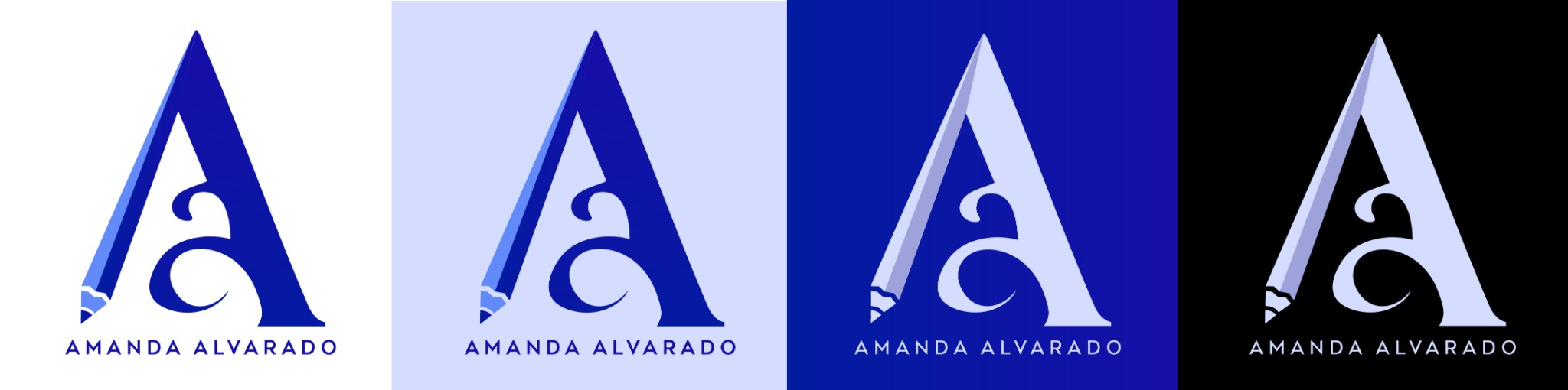
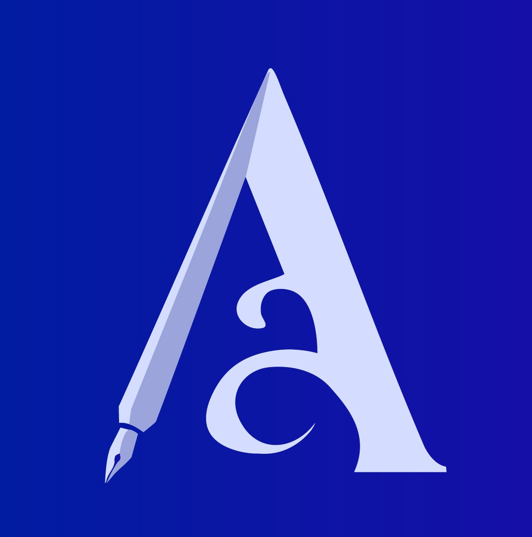
I designed this logo to represent my personal brand as a graphic designer and artist. It features two letter A’s, my initials, stacked in a way that the smaller “a” is nested within the larger “A,” symbolizing both growth and the layered nature of creativity. The left side of the “A” is shaped like a pencil, representing my roots as an artist. No matter what kind of project I’m working on whether it’s digital design or hand drawn art, I always start with a pencil. It’s my go to tool for brainstorming, sketching, and shaping ideas.
The overall design is bold, clean, and elegant, reflecting the kind of work I aim to create: sophisticated, intentional, and visually striking. It’s minimal, but it carries meaning, just like my approach to design.